Email Marketing is one of the most effective campaigns a business can run. It’s one of the least expensive options, and you can run metrics to find out who’s opened your email, how many people clicked on your links, and more. Today I’d like to focus on the design of an email campaign, and provide those without a design-eye a look into elements that should be considered when launching an email campaign.
Many of our customers run email campaigns that effectively connect with their customers, whether it be NCR’s Customer Connect, Mailchimp, or Constant Contact; It’s important that you’ve got the right elements in your email. There are 3 important elements to include in your emails.
- Message
- Visual Hierarchy
- Action Item or “Call to Action”
The “Message” is the most important information you want to get across to your customer. The more defined your message, the easier you make it on your conversion rate. If your message is too broad, it can cause confusion, and you could lose those click-throughs. Here are some examples:
Defined Message, just enough info to keep it relevant.
Hi (Customer name), We’re excited to tell you we’ve got 3 new styles of pants in for the Spring season. We’ve picked out a style for you based on purchases you made when you last shopped with us. Although you can’t try them on online, they’re even better in person. We can’t wait to see you!
Broad message, not as intriguing to read.
We’ve got new styles of pants in for the Spring, and they’re on sale. Come check them out!
In both examples, you can read that the message is, “We’ve got new pants, come in and buy some.” However, it’s important not to treat email marketing as an advertising platform, and start thinking of it as the best way to personally greet your customers. Offering suggestions in the email for a specific style not only feels more personable, but also leads to higher conversion/click-through rates.
Next up is Visual Hierarchy. How does your email look and read. How does your eye travel when looking at your email? Do you look at the big bold text first, the image, the colorful button? It’s easy to put these elements together, but you’ve got to keep it organized. That’s where Visual Hierarchy comes in. By changing sizes, colors, and placement of elements, you can force the readers eye to specific places in a sequential order. Take a look at this email template here:
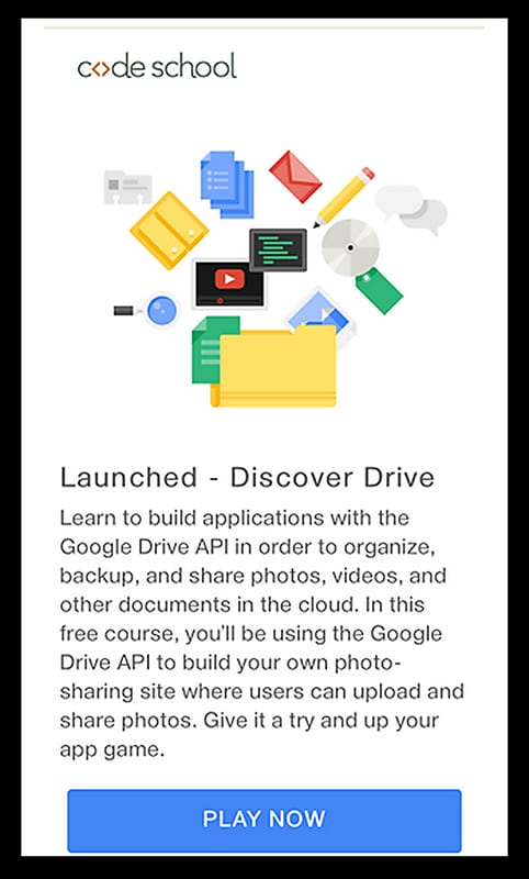
There’s a few great elements in the email. First, the animated .gif that gives a playful feel to the email. You can read more on using animated gif’s in your email here. They have a clear and concise header, slightly bolded (which plays into visual hierarchy) that briefly describes the topic. The secondary text goes into more detail on the topic. If you keep your emails brief and consumable, you’ll have higher quality conversions. They repeat this for a few different topics, and it follows the same structure throughout. So, How did your eye travel when reading that email? Try one of the emails you received in your inbox today. Does it seem to have visual hierarchy?
Here’s another example of an email I received the other day. It’s got great visual Hierarchy, but their message is lost. It just so happens I know what this app does, but if I were a new customer, it would have been confusing.
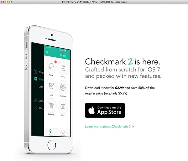
The one things that this email design does best is direct you to an action item. Besides the image of the app/iphone, what’s the next thing that draws your eye? I’d bet it’s that shiny black AppStore button! That call to action will certainly help with conversions, as it’s most likely the one thing you’d be tracking conversion rates upon. So again, this element is key.
Since beauty is indeed in the eye of the beholder, I’ll leave the pictures to your discretion, but I want to urge you to keep your pictures as clear as your message. Show your images to someone that’s not familiar with your business, and ask them what they think the message of the image is. If it’s not in line with your email’s message, it’s probably the wrong photo to use. I’m not going to leave you completely empty handed though. There are a lot of great free resources to help you launch a great email marketing campaign, and I’ll link to some below. If you’d like me to look over your email template, I’d be more than happy to, so just leave a message on our Facebook.
Customer Connect
Mailchimp
Constant Contact
Tips on what to say in your email
Making your email look good on mobile devices (aka Responsive)